Public 360°Design System
User Experience & User Interface
Public 360° is Tietoevry’s enterprise case and document management platform used across the Nordic public sector. As the system expanded across modules and regional offerings, inconsistencies in UI patterns, accessibility issues, and fragmentation across teams created friction for both users and developers. The design team initiated a full redesign and consolidation effort to strengthen usability, accessibility, and long-term scalability.
I joined the initiative midway, contributing to the advancement of core foundations, component refinement, and overall system alignment across products.
Role
Research, sketching, UI design, prototyping, testing.

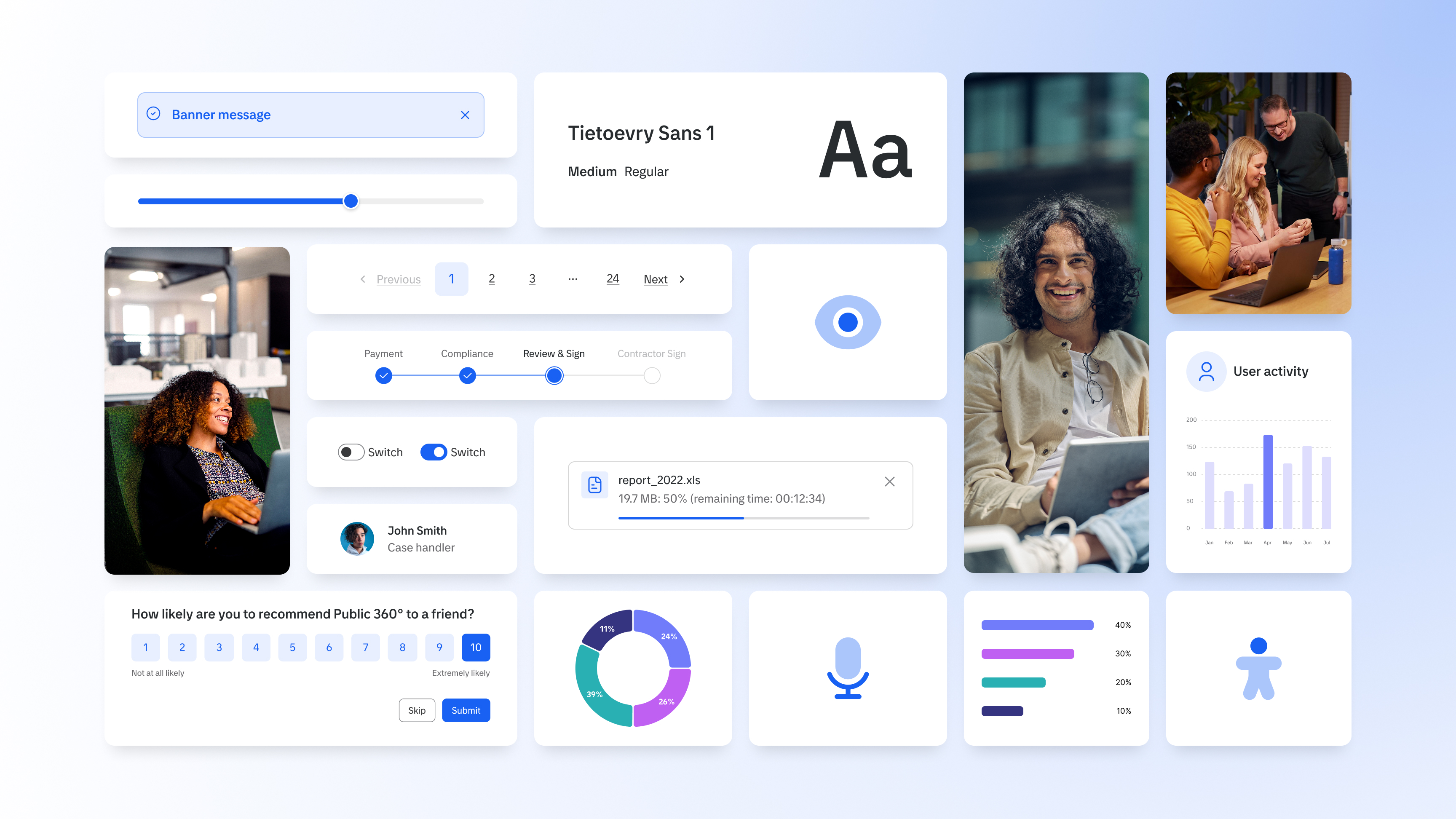
Core visual foundations refined to strengthen clarity, accessibility, and cross-platform consistency.
Project Overview
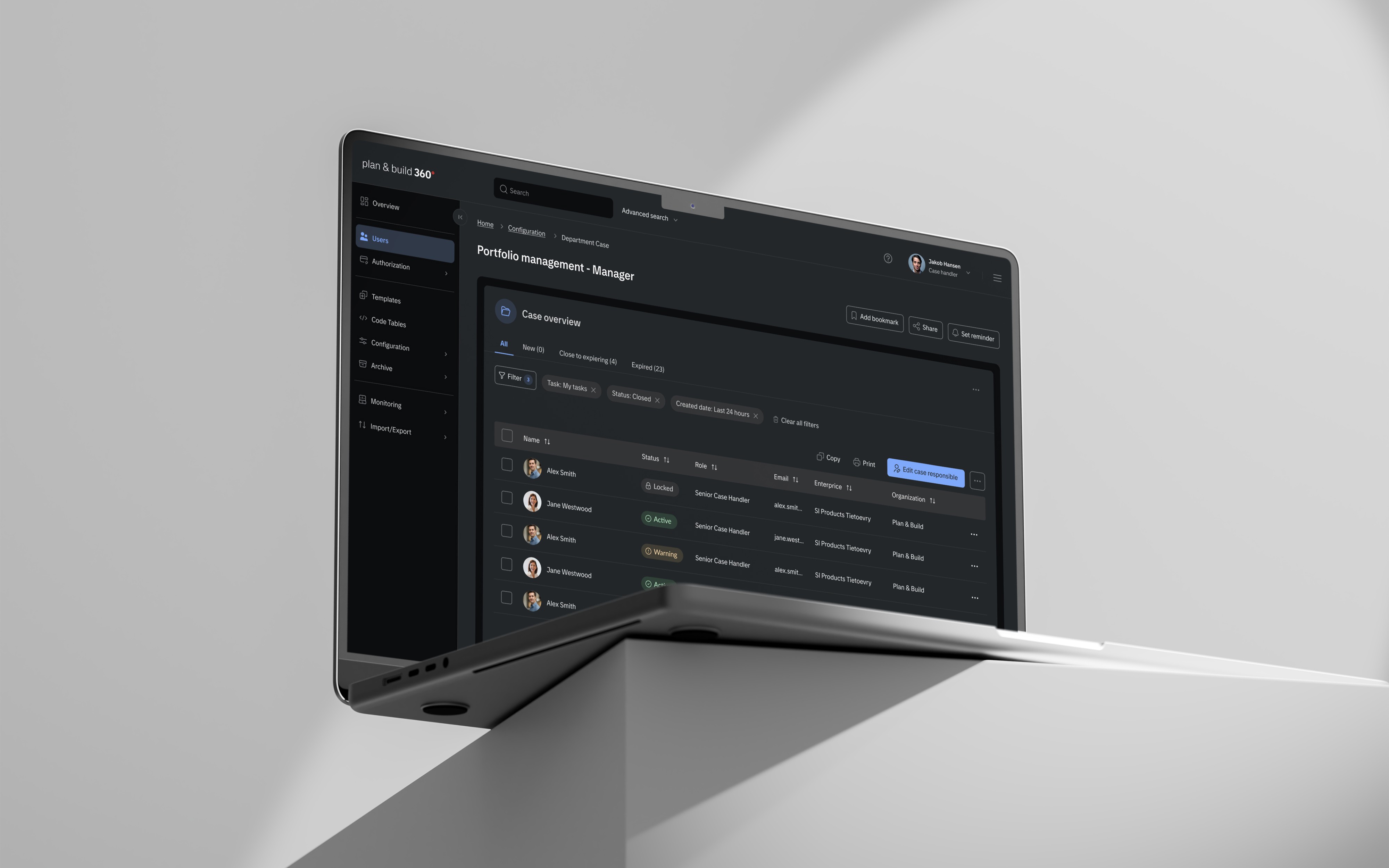
I focused on maturing and extending the design system foundations, ensuring that both the visual language and the interaction patterns supported a consistent, accessible, and scalable experience across the Public 360° product suite.
Key Contributions Included:
- Optimized typography, establishing a scalable type system that strengthens hierarchy and improves readability across modules.
- Refined the color palette to meet WCAG contrast ratios while reducing unnecessary visual noise.
- Strengthened accessibility compliance through component audits and updates aligned with WCAG 2.1 AA.
- Designed dark mode guidelines and adapted components to ensure visual balance and functional parity across themes.
- Established data visualization foundations for clear, consistent charts and analytics patterns.
- Enhanced core UI components, unifying interactions and behavior across product teams and applications.
- Expanded documentation, adding usage guidance, specifications, and implementation notes to support cross-team adoption.
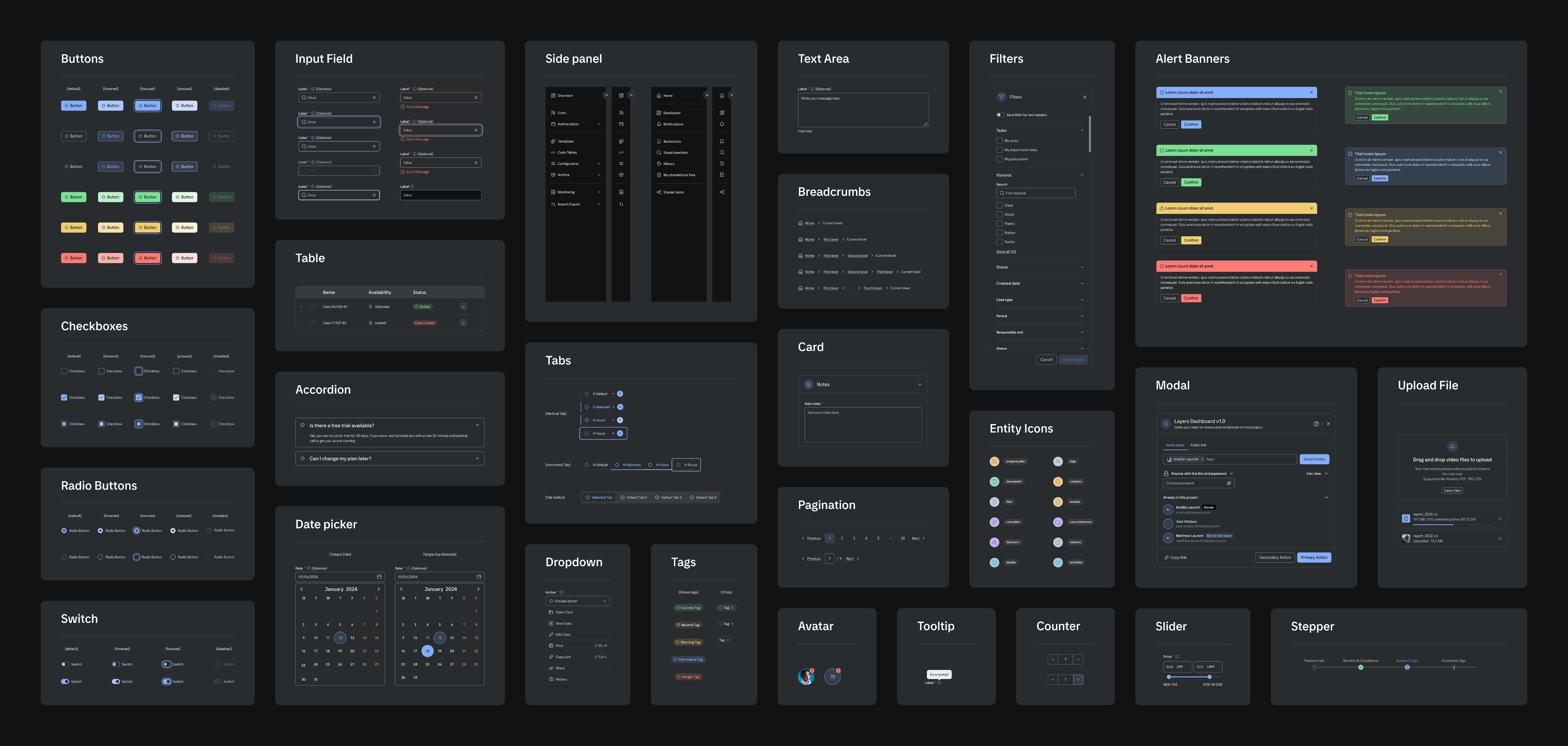
A unified set of accessible, scalable components designed for both light and dark themes.
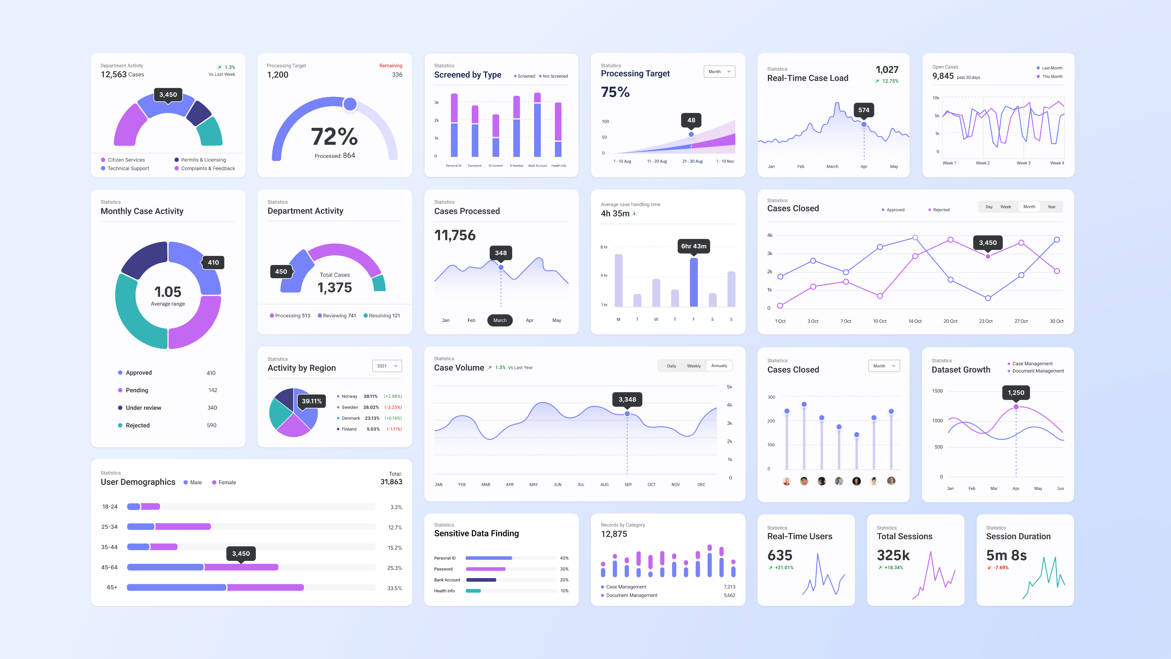
A consistent visualization framework supporting analytics use cases across Public 360°.
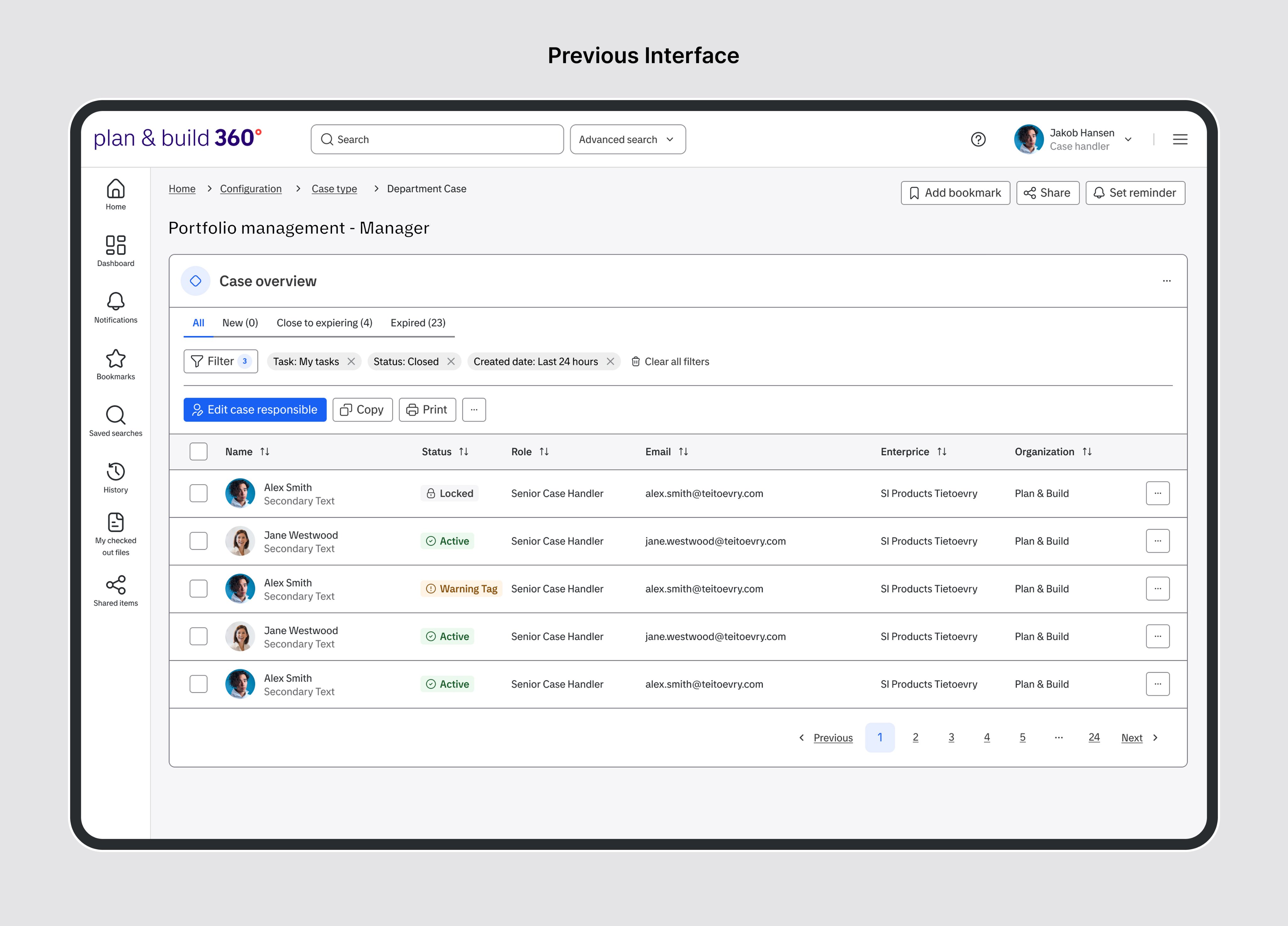
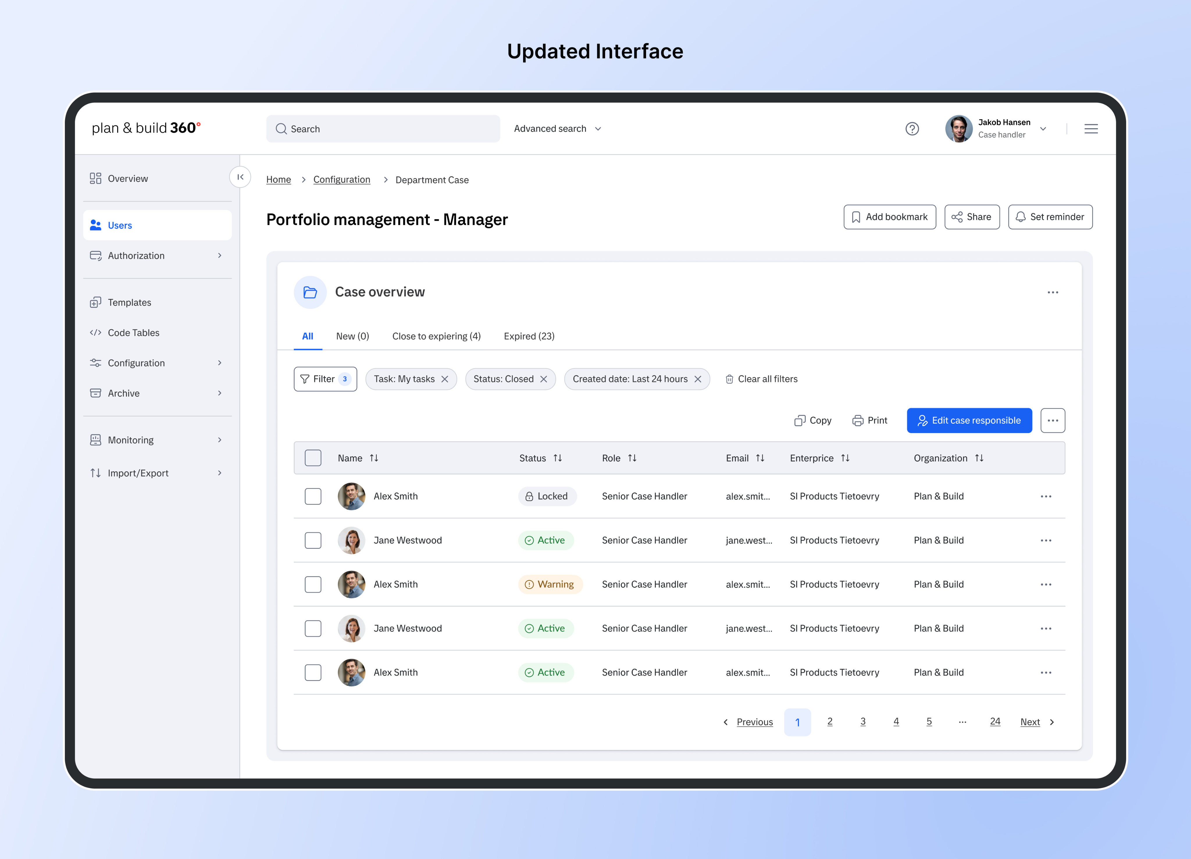
Old vs. New Dashboard Comparison
The updated interface, grounded in the new design system, focuses on reducing cognitive load, increasing clarity, and strengthening consistency across the product. By addressing key issues in typography, color, hierarchy, spacing, and navigation, the redesign delivers a more modern, accessible, and intuitive experience that better supports daily workflows and decision-making.
Key Improvements
- Enhanced typography for improved readability and information hierarchy.
- Refined color usage to reduce noise while improving contrast where required for accessibility.
- A strengthened visual hierarchy that makes actions and key data easier to identify and prioritize.
- Rebalanced spacing and padding, creating a cleaner layout with reduced cognitive load.
- Aligned UX patterns and actions for greater predictability across modules.
- Rebuilt side panel to improve navigation, clarify structure, and reduce clutter in complex workflows.
- Targeted accessibility upgrades that increase usability without overwhelming users with unnecessary cues.
These improvements collectively create a more modern, accessible, and efficient interface that supports faster decision-making and a more intuitive user experience.
Impact
The redesign of the Public 360° design system delivered measurable, cross-functional benefits across product quality, team workflows, and long-term platform resilience.As a result, the initiative produced several key outcomes:
- Improved accessibility compliance, moving core flows closer to WCAG 2.1 AA.
- Reduced inconsistencies across teams through aligned components and unified visual patterns.
- Accelerated development by providing standardized guidelines and ready-to-use assets.
- Strengthened usability via improved hierarchy, spacing, color usage, and interaction clarity.
- Enabled future scalability, supporting new features, modules, and regional expansions without fragmentation.

Other Projects
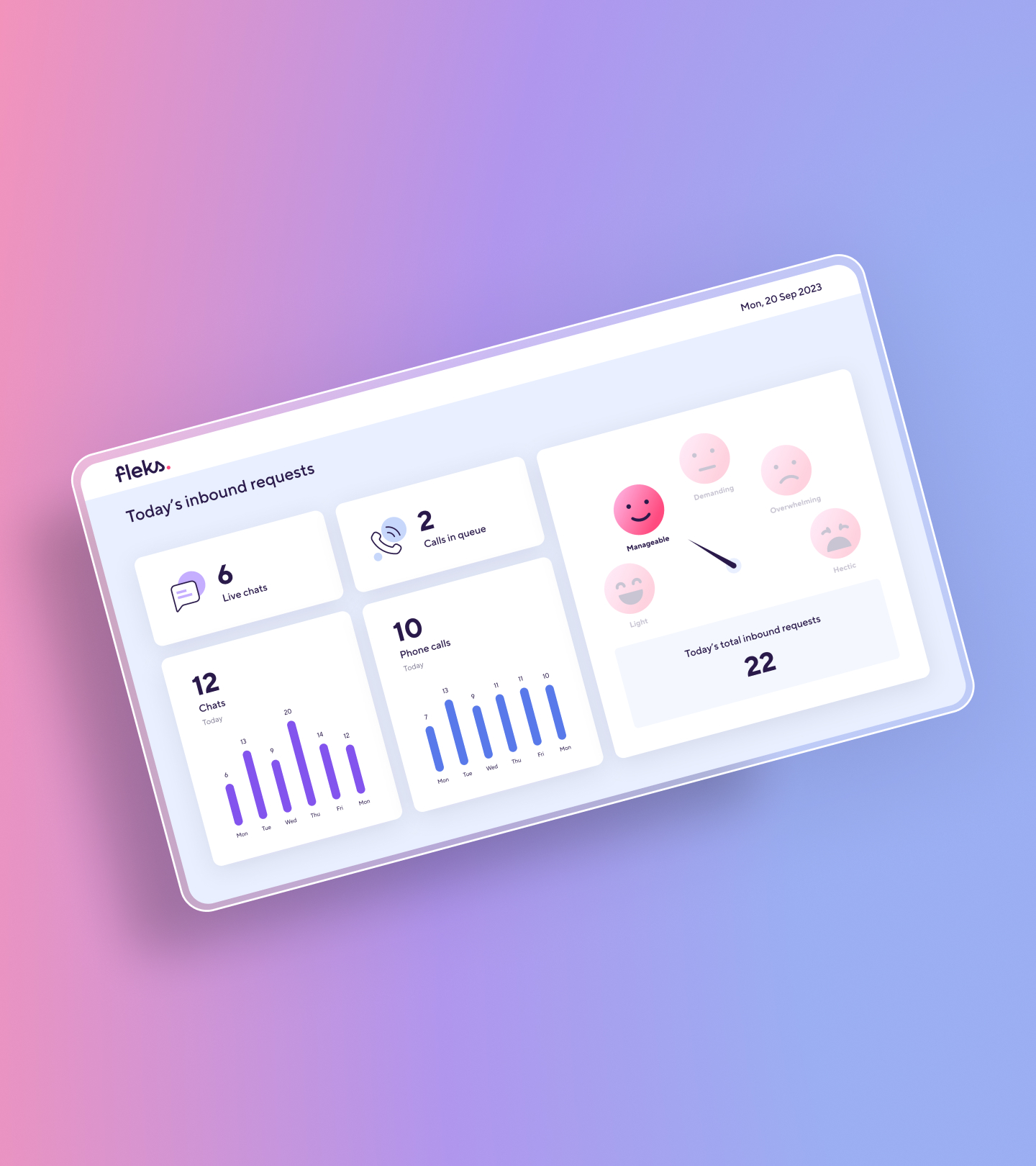
Fleks KPI Dashboards
User Experience & Visual Design
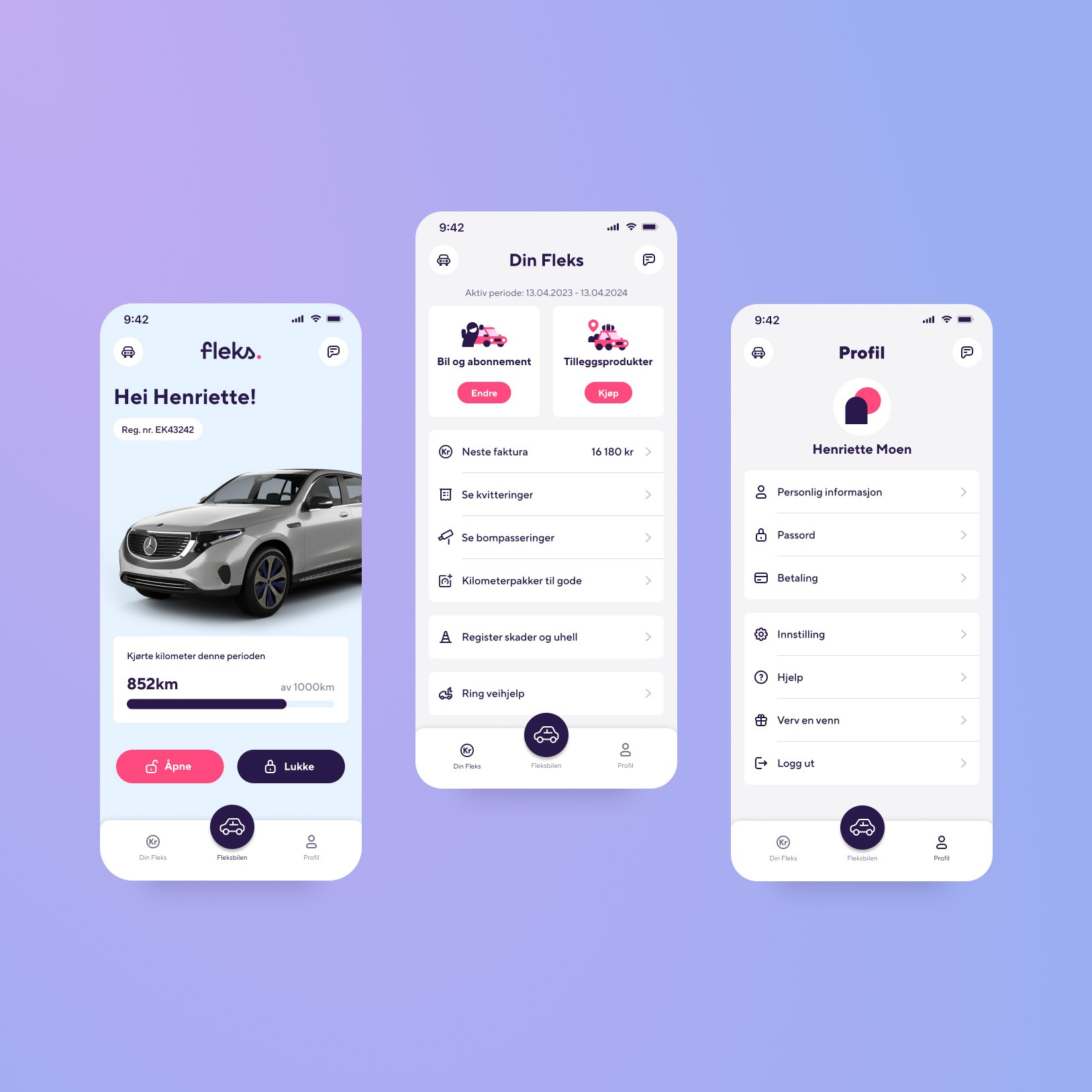
Fleks App
User Experience & User Interface
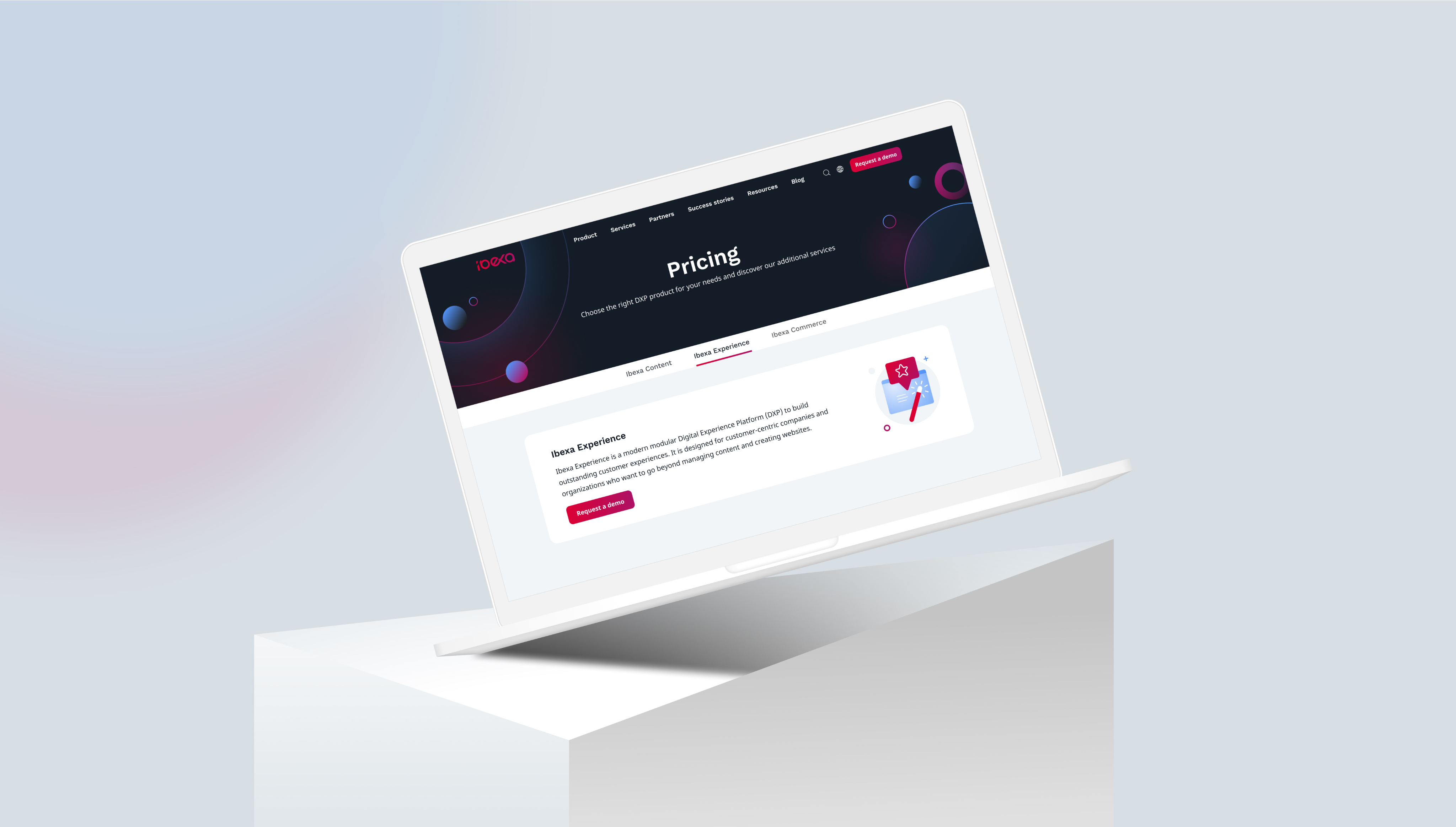
Ibexa
User Experience & Visual Design

© Mariam Yagubi. 2025

Public 360°Design System
User Experience & User Interface
Public 360° is Tietoevry’s enterprise case and document management platform used across the Nordic public sector. As the system expanded across modules and regional offerings, inconsistencies in UI patterns, accessibility issues, and fragmentation across teams created friction for both users and developers. The design team initiated a full redesign and consolidation effort to strengthen usability, accessibility, and long-term scalability.
I joined the initiative midway, contributing to the advancement of core foundations, component refinement, and overall system alignment across products.
Role
Research, sketching, UI design, prototyping, testing.
Core visual foundations refined to strengthen clarity, accessibility, and cross-platform consistency.
Project Overview
I focused on maturing and extending the design system foundations, ensuring that both the visual language and the interaction patterns supported a consistent, accessible, and scalable experience across the Public 360° product suite.
Key Contributions Included:
- Optimized typography, establishing a scalable type system that strengthens hierarchy and improves readability across modules.
- Refined the color palette to meet WCAG contrast ratios while reducing unnecessary visual noise.
- Strengthened accessibility compliance through component audits and updates aligned with WCAG 2.1 AA.
- Designed dark mode guidelines and adapted components to ensure visual balance and functional parity across themes.
- Established data visualization foundations for clear, consistent charts and analytics patterns.
- Enhanced core UI components, unifying interactions and behavior across product teams and applications.
- Expanded documentation, adding usage guidance, specifications, and implementation notes to support cross-team adoption.
A unified set of accessible, scalable components designed for both light and dark themes.
A consistent visualization framework supporting analytics use cases across Public 360°.
Old vs. New Dashboard Comparison
The updated interface, grounded in the new design system, focuses on reducing cognitive load, increasing clarity, and strengthening consistency across the product. By addressing key issues in typography, color, hierarchy, spacing, and navigation, the redesign delivers a more modern, accessible, and intuitive experience that better supports daily workflows and decision-making.
Key Improvements
- Enhanced typography for improved readability and information hierarchy.
- Refined color usage to reduce noise while improving contrast where required for accessibility.
- A strengthened visual hierarchy that makes actions and key data easier to identify and prioritize.
- Rebalanced spacing and padding, creating a cleaner layout with reduced cognitive load.
- Aligned UX patterns and actions for greater predictability across modules.
- Rebuilt side panel to improve navigation, clarify structure, and reduce clutter in complex workflows.
- Targeted accessibility upgrades that increase usability without overwhelming users with unnecessary cues.
These improvements collectively create a more modern, accessible, and efficient interface that supports faster decision-making and a more intuitive user experience.
Impact
The redesign of the Public 360° design system delivered measurable, cross-functional benefits across product quality, team workflows, and long-term platform resilience.As a result, the initiative produced several key outcomes:
- Improved accessibility compliance, moving core flows closer to WCAG 2.1 AA.
- Reduced inconsistencies across teams through aligned components and unified visual patterns.
- Accelerated development by providing standardized guidelines and ready-to-use assets.
- Strengthened usability via improved hierarchy, spacing, color usage, and interaction clarity.
- Enabled future scalability, supporting new features, modules, and regional expansions without fragmentation.

Other Projects
Fleks KPI Dashboards
User Experience & Visual Design
Fleks App
User Experience & User Interface
Ibexa
User Experience & Visual Design

© Mariam Yagubi. 2025
